DialKit
A floating control panel for React, Solid, Svelte, and Vue: sliders, toggles, color pickers, spring editors, easing curves, and keyboard shortcuts wired directly to your UI values. Auto-detects control types from your config, fully typed, with built-in presets and JSON export.
Install DialKit and its animation dependency via npm:
npm install dialkit motionOr just tell your agent to set it up:
Install DialKit (npm install dialkit motion). Add <DialRoot /> as a sibling alongside {children} in the root layout (not wrapping it) and import dialkit/styles.css.
If installing manually, add <DialRoot /> to your layout, and import the styles:
import { DialRoot } from 'dialkit'import 'dialkit/styles.css' export default function Layout({ children }) { return ( <> {children} <DialRoot /> </> )}That's it. Now you can use the useDialKit hook in any component.
Prompts to get started
The easiest way to start using DialKit is to describe what you want and let your coding agent wire it up. Here are a few prompts to try.
Add DialKit to an existing animation:
I have a card component with a hover animation. Add DialKit controls so I can tune the spring physics (visualDuration and bounce), scale on hover, and shadow blur in real time. Use the useDialKit hook with a spring config and sliders.
Build something new with DialKit from scratch:
Create a spring-animated modal component using Motion. Add DialKit controls for: the entrance spring (visualDuration and bounce), overlay opacity, content border radius, and a "replay" action button that re-triggers the entrance animation.
Tune layout and spacing:
Add DialKit to this grid layout. I want sliders for gap, padding, column count (1-6), and card border radius. Group the card-specific controls into a "Card" folder. Use the values directly in the component's style props.
Explore visual variations:
Create a notification toast component with a slide-in animation from the top. Add DialKit controls for: entrance spring, vertical offset, blur amount, background opacity, and a toggle for showing/hiding the close button. Add a "trigger" action to fire a new toast.
Usage
Call useDialKit with a name and config object. Each call creates a collapsible folder in the panel with controls auto-generated from your config.
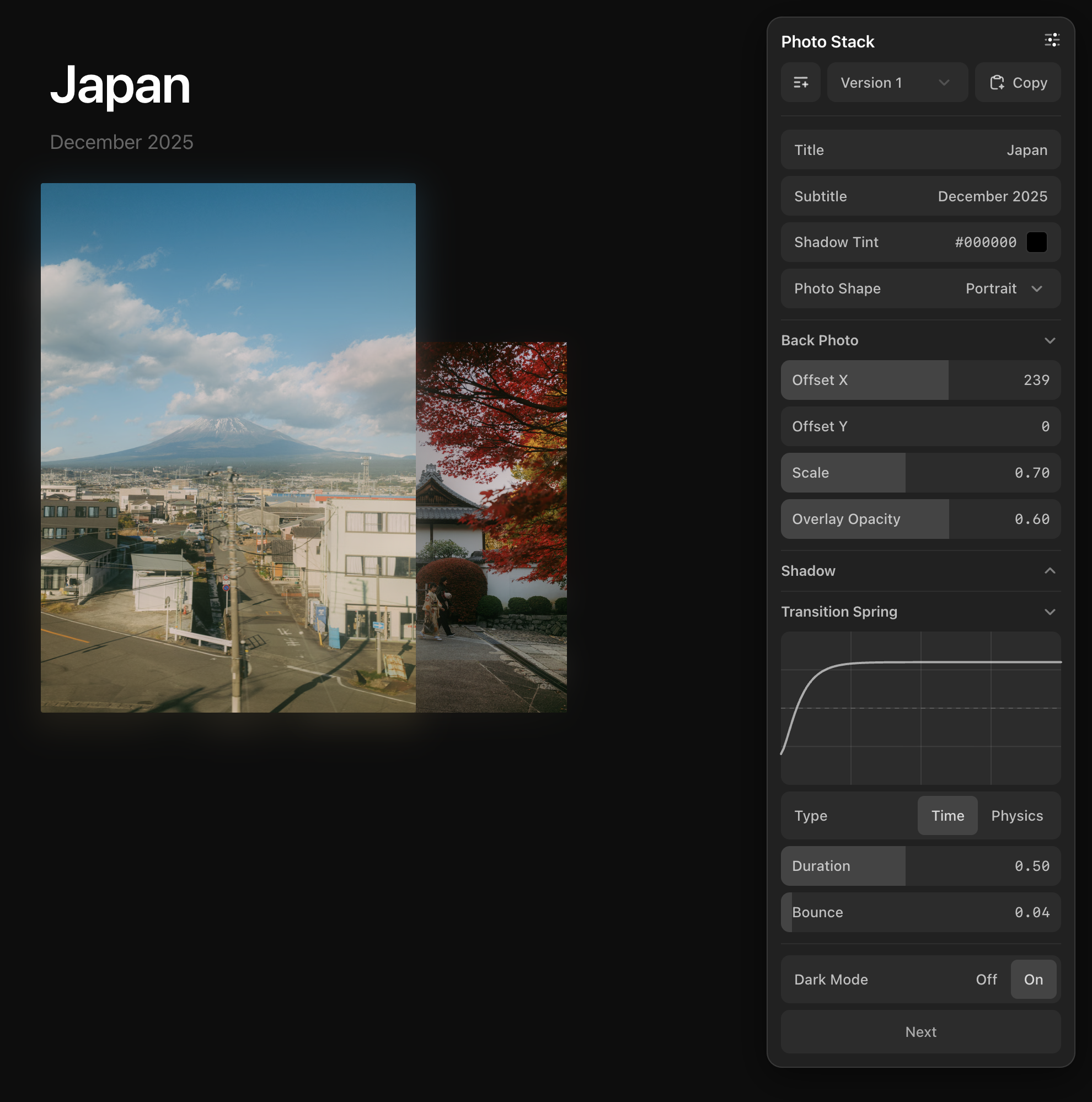
import { useDialKit } from 'dialkit'import { motion } from 'motion/react' function Card() { const params = useDialKit('Card', { blur: [24, 0, 100], // [default, min, max] opacity: [0.8, 0, 1], columns: [3, 1, 6, 1], // [default, min, max, step] scale: 1.18, // auto-infers range color: '#ff5500', // color picker visible: true, // toggle // Nested objects become collapsible folders shadow: { _collapsed: true, // starts collapsed offsetY: [8, 0, 24], blur: [16, 0, 48], }, spring: { type: 'spring', visualDuration: 0.3, bounce: 0.2, }, }) return ( <motion.div style={{ filter: `blur(${params.blur}px)`, opacity: params.visible ? params.opacity : 0, color: params.color, boxShadow: `0 ${params.shadow.offsetY}px ${params.shadow.blur}px rgba(0,0,0,0.2)`, }} animate={{ scale: params.scale }} transition={params.spring} /> )}Config Types
The config object determines what controls appear in the panel.
| Format | Control | Description |
|---|---|---|
[default, min, max, step?] | Slider | Explicit range slider with optional step size |
number | Slider | Auto-inferred range based on value |
boolean | Toggle | On/off segmented control |
"#ff5500" | Color Picker | Auto-detected from hex strings |
"Hello" | Text Input | Auto-detected from non-hex strings |
{ type: "select", ... } | Select | Dropdown with options array |
{ type: "spring", ... } | Spring Editor | Visual spring curve with Time/Physics modes |
{ type: "easing", ... } | Easing Editor | Cubic bezier curve with duration and visual preview |
{ type: "action" } | Button | Triggers onAction callback |
{ nested: ... } | Folder | Collapsible group. Add _collapsed: true to start closed |
API Reference
useDialKit
The main hook. Returns a reactive object with current parameter values.
const params = useDialKit(name, config, options?)| Prop | Type | Description |
|---|---|---|
name | string | Panel folder title |
config | DialConfig | Parameter definitions (see Config Types) |
options.onAction | (action: string) => void | Callback when action buttons are clicked |
options.shortcuts | Record<string, ShortcutConfig> | Keyboard shortcuts for controls |
DialRoot
Renders the floating control panel. Mount once at your app root.
| Prop | Type | Description |
|---|---|---|
position | 'top-right' | 'top-left' | 'bottom-right' | 'bottom-left' | Panel corner position (default: 'top-right') |
defaultOpen | boolean | Whether the panel starts open (default: true) |
mode | 'popover' | 'inline' | Floating popover or embedded in layout (default: 'popover') |
theme | 'light' | 'dark' | 'system' | Color theme (default: 'system') |
productionEnabled | boolean | Show panel in production builds (default: false) |
In popover mode, the collapsed bubble is draggable — drag it anywhere on screen, and the panel snaps to the nearest side when opened. Use mode="inline" to embed the panel directly in your layout instead of as a floating popover.
// Inline mode — fills its container<aside style={{ width: 300, height: '100vh', overflow: 'hidden' }}> <DialRoot mode="inline" /></aside>Toggle
Booleans create an on/off segmented control.
enabled: truedarkMode: falseSpring Config
Spring configs get a visual editor with live curve preview. Two modes available:
// Time mode (simpler)spring: { type: 'spring', visualDuration: 0.3, bounce: 0.2,} // Physics mode (more control)spring: { type: 'spring', stiffness: 200, damping: 25, mass: 1,}Easing Config
Easing configs get a visual cubic bezier editor with a live curve preview.
easing: { type: 'easing', duration: 0.3, ease: [0.4, 0, 0.2, 1],}The returned config is passed directly to Motion's transition prop, just like spring configs.
Color
Hex strings are auto-detected as color pickers with a swatch and editable hex value.
color: '#ff5500' // auto-detectedbg: { type: 'color', default: '#000' } // explicitText
Non-hex strings are auto-detected as text inputs. Use the explicit form for a placeholder.
title: 'Hello'subtitle: { type: 'text', default: '', placeholder: 'Enter subtitle...' }Select
Dropdown control with an array of options. Supports plain strings or value/label objects.
layout: { type: 'select', options: ['stack', 'fan', 'grid'], default: 'stack',}Folders
Nested objects become collapsible folders in the panel. Add _collapsed: true to start a folder closed.
// Open by defaultshadow: { offsetY: [8, 0, 24], blur: [16, 0, 48],} // Starts collapsedshadow: { _collapsed: true, offsetY: [8, 0, 24], blur: [16, 0, 48],}Actions
Add buttons to trigger callbacks from the panel.
const params = useDialKit('Controls', { next: { type: 'action' }, reset: { type: 'action' },}, { onAction: (action) => { if (action === 'next') goNext() if (action === 'reset') reset() },})Keyboard Shortcuts
Assign keyboard shortcuts to controls so you can adjust values without touching the panel. Pass a shortcuts map in the options object.
const p = useDialKit('Card', { blur: [24, 0, 100], scale: 1.2, darkMode: true, shadow: { blur: [10, 0, 50], },}, { shortcuts: { blur: { key: 'b', mode: 'fine' }, // B+Scroll scale: { key: 's', interaction: 'drag' }, // S+Drag darkMode: { key: 'm' }, // press M to toggle 'shadow.blur': { key: 'd', mode: 'fine' }, // D+Scroll (dot notation for nested) },})ShortcutConfig
| Prop | Type | Description |
|---|---|---|
key | string | Trigger key (e.g. "b", "s") — optional for scroll-only |
modifier | 'alt' | 'shift' | 'meta' | Optional modifier key |
mode | 'fine' | 'normal' | 'coarse' | Precision level (default: 'normal') |
interaction | 'scroll' | 'drag' | 'move' | 'scroll-only' | Input method (default: 'scroll') |
Interaction types
| Interaction | Description | Example pill |
|---|---|---|
scroll | Hold key + scroll | B+Scroll |
drag | Hold key + click drag | S+Drag |
move | Hold key + move mouse | O+Move |
scroll-only | Scroll anywhere, no key | Scroll |
Each control with a shortcut shows a pill badge next to its label. The pill highlights when the shortcut key is held. Shortcuts are auto-disabled when a text input is focused.
Frameworks
DialKit supports React, Solid, Svelte 5, and Vue 3. Each framework has its own entry point with an identical API surface.
Solid
Import from dialkit/solid. Uses createDialKit which returns an accessor — call params() to read values.
npm install dialkit solid-jsimport { createDialKit } from 'dialkit/solid'import { DialRoot } from 'dialkit/solid' const params = createDialKit('Card', { blur: [24, 0, 100], scale: 1.2,}) // Access via accessorparams().blurparams().scaleSvelte
Import from dialkit/svelte. Works with Svelte 5 (≥5.8.0). Returns a reactive object — access values directly.
npm install dialkit<!-- Card.svelte --><script> import { createDialKit } from 'dialkit/svelte' const params = createDialKit('Card', { blur: [24, 0, 100], scale: 1.2, })</script> <div style:filter={`blur(${params.blur}px)`}> ...</div>Vue
Import from dialkit/vue. Works with Vue 3 (≥3.3.0). Returns a reactive object.
npm install dialkit motion-v vue<!-- Card.vue --><script setup>import { useDialKit } from 'dialkit/vue' const params = useDialKit('Card', { blur: [24, 0, 100], scale: 1.2,})</script> <template> <div :style="{ filter: `blur(${params.blur}px)` }"> ... </div></template>