Melt Effect
A quick little deep dive on how to create organic-feeling, 'melted' icons, imagery, or text through the magic of SVG filters using feTurbulence and feDisplacementMap.
1. What's a displacement map?
To make something feel organic, we want to morph it a bit. Make it feel hand-drawn or imperfect. We can do that by using a displacement map as an SVG filter.
Here's how that works: let's start with this grid. Now we can make a displacement map: a second image whose color channels encode how far to push each pixel of the source along the X and Y axis. When we apply the map to the source, the source warps by exactly those amounts. Magic!
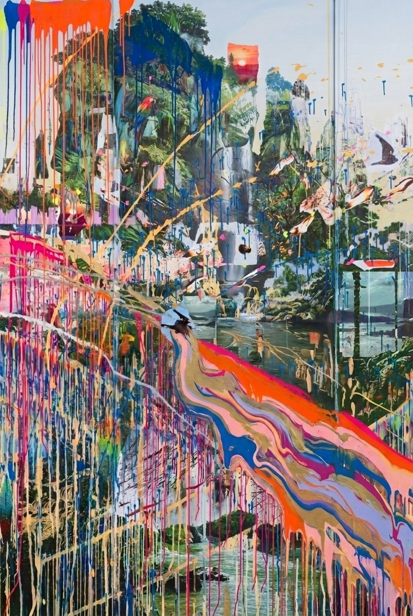
source
map
result
You can use an image for this, and that's useful for say making an image look like a flag or blanket texture, but for this we can just generate one in code. feTurbulence comes to the rescue here. It synthesizes Perlin noise straight onto a render target with no other input needed. The result is the colorful image in the middle panel. feDisplacementMap is the primitive that does the warping: it reads the map, treats red as the X shift, green as the Y shift, and mid-tones as null. The result is that each pixel of the source is offset according to the map.
2. Let's start with scale
Here we have a simple icon, and I've applied an SVG filter to it using our technique. Scale is a property of feDisplacementMap. Remember, that's the primitive that does the warping by controlling the maximum number of pixels each point can be pushed. Drag the slider to see how scale impacts our effect.
3. Shaping with frequencies
scale only controls how far pixels move, but not the shape of the distortion. That comes from baseFrequency, which lives on feTurbulence. That's the primitive that generates our noise map. Lower frequencies stretch the noise into wider, smoother waves while higher ones compress it into tighter, jittery patterns.
The trick to a truly organic feel is decoupling the X and Y frequencies. Mess around with them below.
4. Animating our filter
You can animate any of the properties we've talked about. Below, a 5s animation loops between each parameter's from and to values.
A note on performance. Animating filter attributes re-evaluates the entire filter graph every frame. One filter on one element is cheap, but tens of simultaneously animating filters–especially on Safari–will start to drop frames. If you're doing this you'll want a different rendering path entirely, like recreating these techniques in WebGL.
5. Use it on an image
The filter doesn't care what the source is; it filters whatever pixels the renderer hands it. Drop the same filter on an <img> and the picture melts the same way.
6. Use it on text
You can use this technique on text, too. The glyphs distort visually but the underlying DOM is untouched. Try highlighting and copying the text below.
Highlight this or copy it, baby.
The filter
All the demos above share the same filter shape. You can drop this hidden SVG anywhere in your document. Note the expanded filter region (x, y, width, height). Without it, displaced pixels get clipped at the original bounds.
<svg aria-hidden style={{ position: 'absolute', width: 0, height: 0 }}> <defs> <filter id="melt-filter" x="-150%" y="-150%" width="400%" height="400%" colorInterpolationFilters="sRGB" > <feTurbulence type="fractalNoise" baseFrequency="0.012 0.035" numOctaves="3" seed="4" result="noise" /> <feDisplacementMap in="SourceGraphic" in2="noise" scale="20" xChannelSelector="R" yChannelSelector="G" /> </filter> </defs></svg>Apply it
Reference the filter by id from any element with the CSS filter property. Works on SVGs, images, divs, and most elements.
<img src="/photo.jpg" style={{ filter: 'url(#melt-filter)' }} /> <svg style={{ filter: 'url(#melt-filter)' }}> <path d="..." /></svg> <div style={{ filter: 'url(#melt-filter)' }}> Hello world</div>Copy this prompt
Hand this to your coding agent to wire the effect into any project.
Add a melt effect to [target element] using an SVG filter. Combine feTurbulence (fractal noise) with feDisplacementMap (which warps the source pixels by that noise). Apply the filter to the target via the CSS filter property. Expose interactive sliders for scale and baseFrequency X and Y.