Pasito
A tiny, fully-themeable, and dependency-free fluid stepper component.
Vertical
Set orientation="vertical" and the stepper stacks top-to-bottom. Works well as a sidebar rail or alongside vertically-scrolling content.
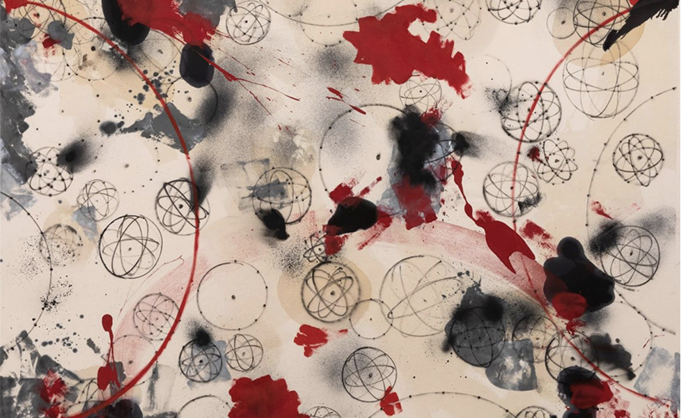
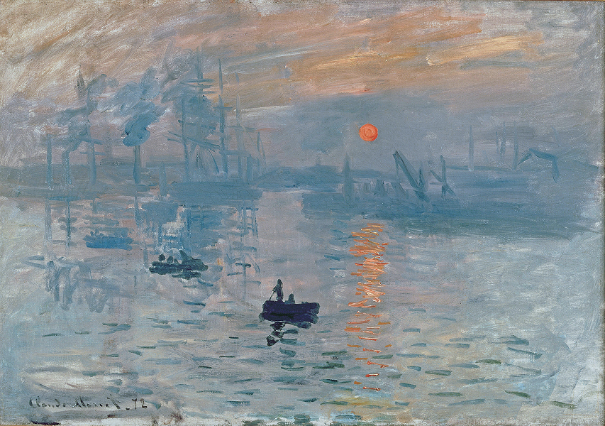
Works by Takashi Murakami and Virgil Abloh
Autoplay
The useAutoPlay hook drives timed step changes with a visible fill animation. Pause, resume, and loop are all built in.
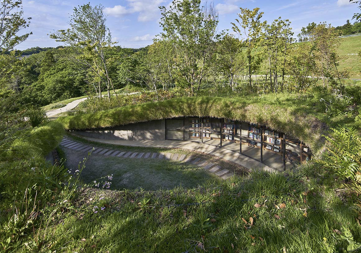
Library in the Earth by Hiroshi Nakamura & NAP
Themes
Every visual detail is controlled by CSS custom properties — colors, sizes, radii, spacing. Override a few variables to match your branding needs.
npm i pasitoOr tell your agent:
Install pasito (npm i pasito). Import the Stepper component and pasito/styles.css, then add a stepper to my file with 5 steps and click-to-navigate.
Usage
import { useState } from 'react'import { Stepper } from 'pasito'import 'pasito/styles.css' function Stepper() { const [active, setActive] = useState(0) return ( <Stepper count={5} active={active} onStepClick={setActive} /> )}Autoplay Usage
import { useState } from 'react'import { Stepper, useAutoPlay } from 'pasito'import 'pasito/styles.css' function AutoStepper() { const [active, setActive] = useState(0) const { playing, toggle, filling, fillDuration } = useAutoPlay({ count: 5, active, onStepChange: setActive, stepDuration: 5000, loop: true, }) return ( <Stepper count={5} active={active} onStepClick={setActive} filling={filling} fillDuration={fillDuration} /> )}API Reference
<Stepper />
| Prop | Type | Description |
|---|---|---|
count | number | Total number of steps |
active | number | Zero-based active step index |
onStepClick | (index: number) => void | Called when a step is clicked |
orientation | "horizontal" | "vertical" | Layout direction. Default: "horizontal" |
maxVisible | number | Visible steps before windowing kicks in |
transitionDuration | number | Transition duration in ms. Default: 500 |
easing | string | CSS timing function. Default: cubic-bezier(0.215, 0.61, 0.355, 1) |
filling | boolean | Show fill progress on active step. Default: false |
fillDuration | number | Fill animation duration in ms. Default: 3000 |
className | string | CSS class for variable overrides |
useAutoPlay(options)
Options:
| Prop | Type | Description |
|---|---|---|
count | number | Total number of steps |
active | number | Current active step |
onStepChange | (index: number) => void | Callback to advance step |
stepDuration | number | Time per step in ms. Default: 3000 |
loop | boolean | Loop back to first step. Default: true |
enabled | boolean | Enable/disable autoplay. Default: true |
Returns:
| Name | Type | Description |
|---|---|---|
playing | boolean | Current playback state |
toggle | () => void | Toggle play/pause |
filling | boolean | Pass to Stepper filling prop |
fillDuration | number | Pass to Stepper fillDuration prop |
Theming
Override CSS custom properties via a class passed to className.
| Variable | Default | Description |
|---|---|---|
--pill-dot-size | 8px | Diameter of inactive dots |
--pill-active-width | 24px | Width of the active pill |
--pill-gap | 6px | Space between steps |
--pill-bg | rgba(0,0,0,0.12) | Inactive dot color |
--pill-active-bg | rgba(0,0,0,0.8) | Active pill color |
--pill-fill-bg | rgba(255,255,255,0.45) | Autoplay fill bar color |
--pill-container-bg | rgba(0,0,0,0.04) | Container background |
--pill-container-border | rgba(0,0,0,0.06) | Container border color |
--pill-container-radius | 999px | Container border radius |
/* Dark theme example */.my-dark-stepper { --pill-bg: rgba(255, 255, 255, 0.15); --pill-active-bg: rgba(255, 255, 255, 0.9); --pill-fill-bg: rgba(255, 255, 255, 0.3); --pill-container-bg: rgba(255, 255, 255, 0.1); --pill-container-border: rgba(255, 255, 255, 0.12);}Accessibility
- • Steps use
role="tab"witharia-selected - • Each step has an
aria-label(e.g. "Step 1") - • Active step is keyboard focusable via
tabIndex=0 - • Respects
prefers-reduced-motion— all transitions resolve instantly